 |
|||||
 |
|||||||||||||
|
Wise Choices When Starting a New Business The number of decisions to make when starting a new business may at first seem overwhelming. This class will provide you with enough information to make many of those choices wisely and, when appropriate, how and where to seek assistance. This handout covers how to design and present the public business identity from creation of the logo and letterhead to advertising and marketing. The Design and Marketing Considerations Successful businesses generally have a couple of things in common a clear understanding of their product and potential clients as well as
Assessment Probably the most difficult thing for most people to do when starting a business is to realistically assess the market and the public's interest in their product or service. This is so common because making the choice to start your own business is deeply involved with your ego and sense of self-worth. In some ways what you are selling is yourself. What is the actual market interest for this product? Your friends are usually the poorest guides, as they will naturally want to please you. Perhaps paying for market surveys makes good sense, but, since that costs money, many forgo this important step. After defining the level of interest in the product, take time to look at the reasons and motivations that spurred you to risk a move from the "security" of working for someone else, to the potentially more rewarding position of working for yourself. What makes your business different from the rest? More importantly, what makes you different from your competitors? Create a list of the SPECIFIC ways your company differs. Of course, you also need to list your liabilities what advantages are there for your competition? Once you have defined your product and position clearly, you will need to identify your customer just as accurately. What is the age group? What is the income? Where do they shop now? Again, there are market analysts that specialize in this information. You can probably save serious money by researching this area on your own. Here are some tips: call the local TV station(s) and ask for market reports and recommended advertising approaches, do the same with radio stations and newspapers, and use "spies", i.e., your friends, as this is where your acquaintances can be really helpful by simply relating where they or their children and friends currently purchase your product. Be aware that radio and TV stations and the local newspapers will have a serious bias in their presentation of advertising recommendations, so be sure to listen to all of them before deciding what makes sense for you. Find out from your friends what motivated them to purchase where they do. This will also help to guide your advertising placements. OK, now you know your competition and your customers. What is going to attract people to buy from you? Studies have shown that people buy for the following reasons:
How many of these can you control? All of them to varying degrees! Clearly, awareness of your presence and products is a function of advertising or word-of-mouth. But what components of your advertising impact how well the buying public remembers you? Simplicity and consistency are probably the most important. Price is a function of how you buy and your overhead expenses, so up here in the mountains price is unlikely to be the main motivation for your b
In this paper we will focus will on awareness and confidence. These factors are covered by a discussion of the design of the logo, letterhead , business cards, advertising and the consistency that sells. Names, Logos and the Difficult Process of Being Simple The most common mistake new business owners make is to think that detail equals information. Strangely, it is almost the exact opposite. For every component of your logo design and paper identity, remember to ask yourself, "What purpose does this serve. Where will the public see it? What is the message I am trying to get across?" A simple example, to which we will return later, relates to business cards: do you use them to simply remind customers of your name and business location or are they intended to act as advertisements? The purpose drives the design. Most often simple business cards are the most effective. So now we move into the realm of business identity and logo design. This new baby of yours has consumed hours of time and put you through painful reevaluations, resulting in a sleek, powerful selling machine. You want everyone you've met to know everything about it, because anyone who knows as much about your product as you do will buy it, won't they? You know, you're probably right. People who know as much as you do will likely use your products or services. But (you knew there was a "but") almost everyone won't take the time to learn about your product or services like you did. They must be sold. How do you sell people? The first consideration is the business name. You probably have already decided on the name for your business, but just in case you haven't, here are few ideas. Business names can be protected, so
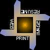
Next, think of the "Golden Arches" or "Mc...." anything. Who owns those concepts? Those arches have only two words associated with them, but they are a powerful image because they are easy to grasp a simple symbol. Logo design can be an expensive process: hiring a designer to think about your product and business name, trying to develop a visually appealing, easily reproduced image that can encapsulate your business identity. You can make this process more cost effective by designing the logo yourself or having ideas ready to share with the designer. In my experience, the biggest difficulty working with new business owners is their desire to say everything in a very small space. Also, your logo may need to be flexible enough to serve as a sign, such as the "76" gas logo, and still function as an identifier on a business card. In the process of design, try to think of the various ways you will use the logo. This helps in the formation of the design of the logo. I am sure you can think of more, but, at a minimum, logos have been used as key components of business cards, letterheads, flyers, display ads, TV spots, signage, invoices, watermarks, hats and caps, shirts, and even one rock singer's name. See figure 1 for a card and letterhead combo. Here are some of the considerations for the design of the logo. How will it be printed? What is its primary use? If you can capture the essence of your business ident- ification in black and white, this will be the most cost effective. Black ink on white or colored paper is by far the easiest and cheapest to produce, and can likely be printed entirely in-house by storing the image file and placing it wherever it is needed in documents. Also, very low-cost printers can render the image with acceptable quality. AT&T's logo comes to mind here, as depicted in figure 2, no grays are used and yet the mind sees it as a 3D image symbolic of the entire globe. Now why am I making such a big deal out of grays or the number of colors here? The reason is that they are expensive to print. A decent laser printer (300 dpi or dots per inch) can print good quality letters of the alphabet, but fails when trying to reproduce the subtle grays of a photograph (see figures 3 and 4). These printers are cheap, reliable and don't need much memory to do their job effectively. So if your design needs those shades of gray, the cost for a gray-capable 600-dpi printer doubles and the memory to serve it quadruples. Not only that, but your gray artwork will not photocopy well. In addition, fax machines also do not handle gray effectively (see figure 5) and practical color faxing is still in the future.
From the above discussion, it is apparent that for small businesses, it is wise to carefully consider the design of the logo and ID to minimize costs. Since most businesses have an in-house computer and printer, the most cost effective answer may be to print your own forms as needed. When determining the logo, etc. have the actual method you will be printing or reproducing them firmly in mind at every stage of the design process. Remember to keep it simple and that the smaller the logo or design, the less detail there should be in it. Using AT&T's globe logo as an example again (figure 2), notice how the number of segments used to depict the image varies according to the final size. Before the logo is finished, print it using the actual methods that will be used in your business. Size it to fit a business card (2" X 3.5"). How does it look? Generate a letterhead or invoice and photocopy it. Then fax it. Does it still stand up? How does the logo look when blown up for a sign? On the internet, which sooner or later will be an important component of most businesses, you will not have to be concerned about the limitations of the printer and the printing press. You can easily make the design as colorful as you wish, but remember to keep the logo design consistent with the paper appearance. Next consider the choice of typefaces (sometimes called fonts). Every style of typeface lends the words an emotional feel. Bank Gothic has a substantial, slightly old-fashioned look. It works for serious looking messages. Shelley Allegro is a flowing script with a soft, feminine appearance. Choose a typeface that supports your business image. For a hypothetical company called "Parties Galore" a fun typeface works well that would look completely improper when used for a hospital. Figure 7 shows a few typefaces in a single size, note that there are two broad classes of typefaces, serif which have little turns at the ends at the ends of the strokes, and sans serif which are very clean and have no
Once the logo is done and the typeface(s) chosen, use them to create your business cards, letterheads, invoices, order forms, advertisements and so on (see figure 1 again). Every time the customer sees that same design, your business is reinforced in his mind. Clever uses, such as creating a watermark or lightly gray background with your logo are effective too. If you have someone else design your logo, be sure to have them give it to you on a computer disk (even if you don't personally have a computer) and print out a few master copies for your files. If the designer produces it manually, be sure to keep the original in a safe and clean environment. Advertising Your initial connection with customers will be through advertising, which costs. Under-capitalization is the primary reason that well -researched businesses fail, and that failure occurs typically in the first two years. The primary area that tends to be ignored is advertising. Sadly this is not the place to cut corners. The good news is that if your product and service are attractive, repeat business will become important as you will slowly pick up other customers through word-of -mouth. Advertising plans should be in place with their monies before starting a business. This plan should include design and printing of business cards, poster templates, signage and a consistent, long-term advertising scheme. The reason for the emphasis on consistency is associated with how the human brain works. Repeated exposure to the same image again and again increases recall. One of the focuses of getting customers into your store is awareness and repeated exposure is the key. Similarly, if you use radio or TV, keep the jingle consistent. With newspaper ads, do not expect much from a single placement. It is the campaign that builds customer awareness and confidence. Also, planning for the long run will save you money per ad compared to isolated display ads, since most advertising media offer a discount based on the number of weeks or months you commit to. You will be able to vary the ad's content each week but not the size. To promote general awareness and interest you have many choices the Yellow Pages, newspapers, radio, TV (up here it is the cable adnet) , the chambers of commerce, sponsoring of special events, the internet, direct marketing through the mail, signage at the business location, signage at the jobsite, signage on your vehicles, coupon books, coupons on the back of grocery receipts, handing out your business card everywhere, running a text-based ad on the Weather Channel, putting your name on ball-point pens and so on. Which of these really work? Which are most cost effective? The following information was gleaned from an informal survey of many local business owners who operate a variety of types of businesses including printers, retail stores, food stores, lumber yards, and sign, music and sports stores. Up here in the mountains with a lower income fixed population and a higher income part-time second home population, the overall most important and potentially cost effective advertising medium is the Yellow Pages for almost all business types. This is the place where both groups will most likely turn first if they don't already have a place they know about. Very few businesses can afford to ignore the Yellow Pages, but most can afford to avoid the alternate directories. These poor sisters are rarely used by customers instead of the "real" directories and therefore represent an effective way to waste your money. However, the decision about the ad's size, placement, number of colors (and therefore cost) is considerably more complicated. The first thing is to determine the category or categories where your ad belongs. Then check out what your competition is doing. Very effective ads can run as little as $30 per month (1996 $) for a one-inch inline ad to $1000 per month for a full page display ad with color. The size of your ad may be important if, for example, you own a retail music store, where a small ad may imply you have a dinky site with a limited selection. The choice between an inline ad and a display ad is a tough one. Many people look at the display ads first, while others peruse the alphabetized inline section. Which type of person will be looking for your business? The local consensus on using color in a Yellow Page ad is that generally it is not helpful. There was a stronger opinion about red, which one printer feels is both a weak and a cold color. The local newspapers were felt to be too expensive for the results obtained by all respondents. Those who had used the newspaper had eventually stopped using this method due to the perceived lack of response. It should be noted here that for a newspaper ad to work, it must be part of a long-term campaign which can establish your presence more solidly. A single spot ad is not an effective way to gauge the efficacy of the newspaper medium. Two people mentioned that the free paper, the North Tahoe Truckee Week, had a reputation for being the most cost effective and one used it to attract tourists. This makes sense since a free paper is more likely to be picked up by non-locals (who don't care about local news) to peruse the ad content alone. In newspaper ads, you need to consider whether to run a display or classified ad, how many colors to use, section for the ad and more. Costs for ads in the newspaper are fairly high, and can easily exceed the cost for the Yellow Pages ad. They are priced primarily by size and color content. It is possible to produce an insert that is delivered with the newspaper at fairly reasonable cost. Radio is quite ineffective in the mountains. First there is no local station, i.e., in North Shore or Truckee. Second there are too many stations of similar format to choose from for the customer. Go around to different businesses and see what they are listening to and listen in on your friends choices of radio stations. You will discover no strong preference. If there are one or two stations that predominate in a market that coincides with yours, then radio might work for you. TV using Cable Adnet got mixed reviews with most feeling that this medium is too expensive for the results. All had used TV at one time or another (one for 5 years) but most were currently not buying air time. One business, however, felt that consistent TV exposure was a key ingredient in the success of his business. Channel 6 is becoming much more popular since the high school and John Echols took it over, and is one of the less expensive avenues of TV advertising. A different type of TV ad is the running marquee ad at the bottom of the Weather Channel's local forecast. This has not been used extensively even though very inexpensive, but could be effective depending on the business type and ad copy.
The local chambers of commerce are a tremendous resource for the small business owner. They provide contact with your fellow owners and also produce a monthly newsletter that may be a good vehicle for advertising. In addition they will provide referrals to your business on a rotating basis with your competitor members. Usually these chambers are partially supported by the county or city and are relatively inexpensive to join. Sponsoring and supporting local events has proven to be important in the early stages (and for some, throughout the life) of the business. Besides being a community- minded thing to do, local sponsorship and support generally brings recognition and awareness of your shop. Some folks said the direct benefit to their business faded after several years and others claimed it was an important ongoing facet of their marketing and public persona. The internet is beginning to be an important marketing mechanism for some business. If yours is intimately tied to computers or travel, then you would be wise to explore this avenue. The net is very useful as a data resource from general business information to market updates. Remember you are competing with over 400 million other pages so you must plan your strategy carefully here. Studies show that only 15% of hits come from search engines, while 35% are generated from links and fully 50% are the results of your other media (newspaper ads, mailings, etc.). Almost every business will need signage. There are three important types storefront, vehicle and jobsite. These days more signs are produced by computer aided design than any other method, say air brush or painting. The design is scanned into the computer or drawn using the computer which controls cutters or printers that reproduce the image onto the signage medium. One of the most cost effective methods is to cut self-adhesive vinyl using a computer controlled plotter. This cut design is then laid out and adhered to the sign board (usually plastic, magnetic rubber or reinforced fiberglass). This method will also work for permanent vehicle and store window signs. Computer manufactured signs are less expensive and more consistent than the handmade signs which are still made and may feel more personal and warm. Coupon books in which the business pays to advertise received a unanimous thumbs down. However coupons on the back of grocery store receipts were considered by one business to be the very best form of paid advertising. This business also negotiated a non-compete agreement where his would be the only business of that type that could use the coupons. He still receives coupons after five years of continual usage. Seminars, such as this, can be used to increase awareness of your service or product. Be sure to provide the attendees something of value during the seminar and remember to include your business cards and/or brochure as part of the package given to them. If you provide a reference handout, be sure your business name is prominent on it. And of course, cold calling will work, but requires the type of personality that is willing to accept rejection and bounce right back. If cold calling is your style, be sure to be completely prepared, including having business cards, Rolodex cards, brochures and product literature ready to offer the potential client. Consider including a coupon good for a discount or some other attractive offer to entice your prospect. Good cold calling is an art not all will be willing to master. Remember to network with everyone you know, and even network with your cold calls, asking if they know anyone who could use your services or products. Keep accurate records of ALL calls you make, preferably as soon as you have completed them. Note that studies have shown calling in person will be more likely to bear fruit than a telephone call. Conclusion The old adage of location, location, location is fading with the advent of fax machines and telecommuting; but planning, planning, planning has never been more important to the success of your business. The cost analysis of producing and marketing your business identity can and should be done as soon as possible. Then your marketing plans can be put into place early with the consistency to produce your eventual loyal customers. |
|||||||||||||
|
Riley Works |
|||||||||||||
|
37366 Camp Creek Road, Springfield. OR 97478 USA |
|||||||||||||
|
Phone: 541-726-7220 |
|||||||||||||
|
Copyright © 1998-2004 by Riley Computer Works. |
|||||||||||||